Art on a Shelf: Ore no Ryomi 3 (part 2)
I have no doubt you are nearing the hundred thousandth time of hitting the refresh button, desperate for the next installment of Art on a Shelf. For days you’ve probably slept very little, hoping that the next time you visit the blog it will be posted. Well deprive yourself of sleep no further, for it is here.
Today we’ll take a look at the delicious food art of the game.

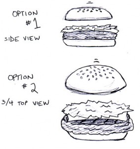
Here you can see the earliest sketch of the burger, everyone’s favorite food to prepare. EVERYONE’S. If it wasn’t yours, you’re going to Blog Time-out, because I don’t want to hear it. In this rough, I presented the side and 3/4th top down view for consideration. After heated debate (also described as “David telling me what he wanted me to do”) we chose the 3/4th top down approach. Not only did this make the food look more like food, but it also increased what I call the “Delicious Factor” by nearly 50%. Tell me you’re not drooling looking at some of these images! (If you tell me you aren’t, that’s a trip straight to Time-out, mister! It was a rhetorical statement.)
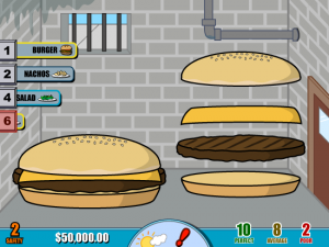
Mmm MMM! You can almost smell the grilling beef! Though that may be my laptop overheating again. In this image you can also see a super secret new sidebar which had “stations” which correlated to the key you’d press to prepare an order. That way the burger wasn’t ALWAYS the same number. Yes, this game was going to keep you on your toes. Maybe one day “burger” would be button 2, but then BAM! Next day it’s button 4! Did we just blow your mind?! I bet we did. Or would have, if the game had been released.
![]() This is my favorite sprite test of all. Click to enlarge the image. (Go ahead, I dare you.) I spent a long time making that tomato slice. Perhaps too long. It was a labor of love, being my favorite fruit. This would be the style of all the food that would eventually end up in the final game. The final game that was simply not meant to be… But that doesn’t mean we can’t talk more about it!
This is my favorite sprite test of all. Click to enlarge the image. (Go ahead, I dare you.) I spent a long time making that tomato slice. Perhaps too long. It was a labor of love, being my favorite fruit. This would be the style of all the food that would eventually end up in the final game. The final game that was simply not meant to be… But that doesn’t mean we can’t talk more about it!
In the next installment, which is likely the last since I am running out of unreleased art, I’ll be discussing the concept of 안전한 카지노사이트 Character Challenges that we were planning. I don’t want to give too much away, but they were essentially challenges based around characters. Oops, I may have said too much.
Until next time…

I actually hate tomatoes. Hate them. I’m sorry. ;_;
I quit the blog. I can’t work with someone who hates tomatoes. I don’t know how I ever thought this could work.
😯
Have you ever just taken a bite out of a whole tomato? Eaten it like you would an apple?
I remember hating tomatoes when I was small, and refusing them whenever offered my entire life.
Then, only about last year, I figured, ‘maybe I’ve been unfair to tomatoes, maybe I should try one’. And then I did, and then I almost threw up.
They are just the most vile abhorrences to ever find their wicked ways to the innards of an otherwise good sandwich. Or, indeed, the innards of anything.
Tomatoes rocks, you SUCK! Try mushrooms THAT is awful.
I do like tomato sauce though. The sight of tomatoes beaten into a red mash of goo delights me.
two things
1. best prep is salad because it’s easy and i like feeling generous by giving tons of croutons because they are delicious
2. tomatoes are horrible tasting as anything but sauce or ketchup
Ah, looking great Chubs! I’m sorry things never worked out because of all the things that got in the way. I can’t wait to see this finished! 🙂
amg that burger looks like it’s in jail!
“amg that burger looks like it’s in jail!”
That’s because the background for the starter restaurant was in a basement and made to look as terrible as possible! That way you would want desperately to upgrade to a non-ugly shop.
JKR, Sara just criticised your art. Don’t take it.
Anyway, the art was really nice. I can’t help but think that the sprites could use a bit more lighting to them, or was that meant to be added in-game…?
Lighting, eh? You mean more gradients and shadows? We opted for a very graphic style, mainly because that’s my MO; graphic styles. In terms of a realistic method of shading and effects, that was a little more common to the previous artist Chubs had, as seen in this old blog entry: http://www.vertigogaming.net/blog/2008/04/03/the-many-faces-of-ore-no-ryomi-3-part-2/
I think I would have likely increased the strength of the graphic shadows on the food before all was said and done, though. It’s a bit too subtle as is.
Until a few years ago, I didn’t like tomatoes at all and always opted out for them. Now I’ve really started enjoying them though, they really add some tastefulness to an otherwise dull sandwich! They’re also great in burritos.
“They’re also great in burritos.”
Totally agree. A burrito just isn’t the same without some tomatoes in there to juicy it up. 😀
Just like how pizza wouldn’t be the same without the sauce. Which is tomato in another form.
“JKR, Sara just criticised your art. Don’t take it.”
Augh…don’t make stuff up. 🙄 There are just bars on the basement windows and I was being silly. My bad for not inserting a winky face to prevent people from reading too much into it.
You don’t know my personality yet, but if I was criticizing…you would definitely know. 😐
sara, don’t worry about it; lost was joking too
we all knew you were joking 🙂
Yeah, Sara, it was all in good fun. I don’t think Lost meant it like that. It’s a pretty laid back blog for commenting on here. 🙂
Yeah, I was just being sarcastic.
Although, now that you mention it…
(Just kidding)
Lol, this reminded me to reinstall ONR2. 😀