Functionality over Style: The Horrible Battle.
Over the last few weeks of making Spirits, I was wrapping things up, but I knew I was leaving the worst for last. No, I thought, better I get this out of the way first. So I drew it out on a notebook. Did more work in my sketchbook during workin’ at Starbucks. Nothing seemed to fit. I started to finish up all the loose ends in Spirits. Today, I finished the Free Play mode which left…the Puzzle menu redesign. Oh no.
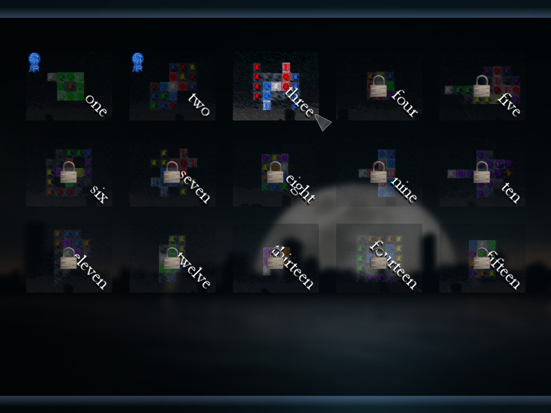
Above is the old menu I posted in the blog a few weeks ago, and it was the menu that went out with the beta. People seemed to be universal in the dislike of the puzzle menu. I really didn’t want to hear that…the menu that was there was already working and ready to go…but it had to be changed.
Menu design up to this point had been generally easy. Most menus showed no more than 9-10 levels at a time, it flowed really well, and showed nice structure. Now i had 53 levels to display in an orderly fashion that fit the style with the main game. The easiest thing I could do was to have the user click on some arrows and move the number up and down, then pressing enter to go to that level. But it didn’t work…well, it did work, but it was not working in both functionality or design. I went back to the drawing board with multiple menus, and even joe_042293 got in on the design:
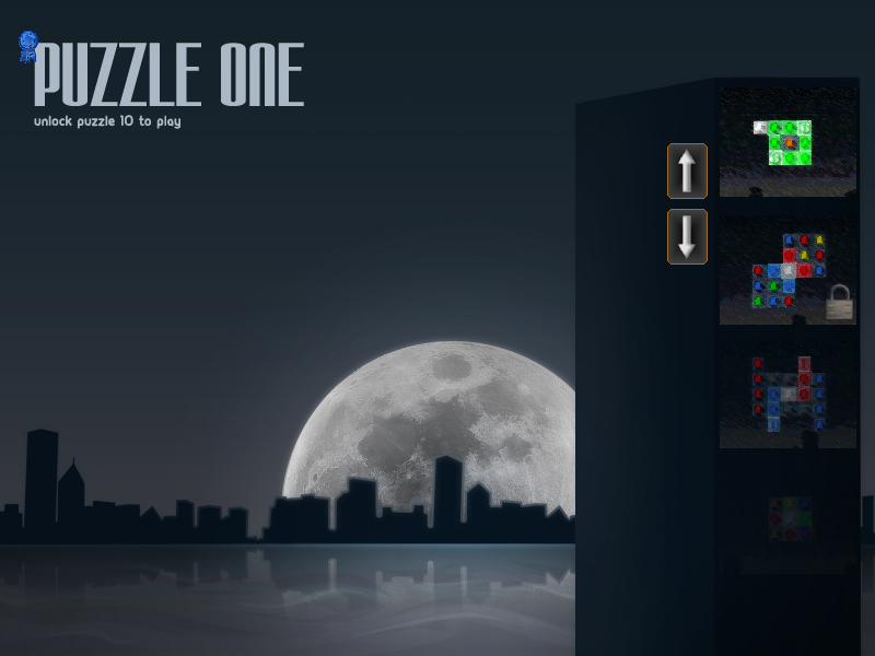
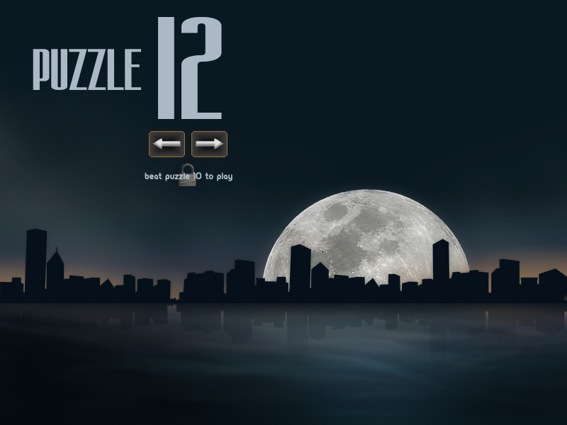
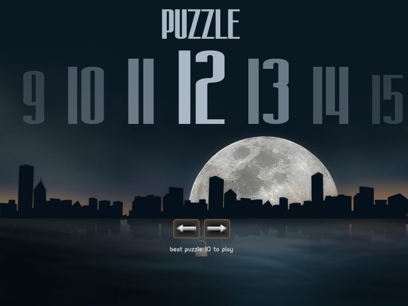
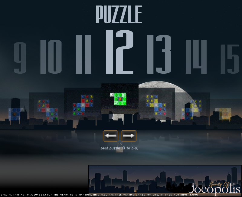
And so, I stopped going for artistic. I went for functionality over style, and I think I finally created a menu that I can work with.
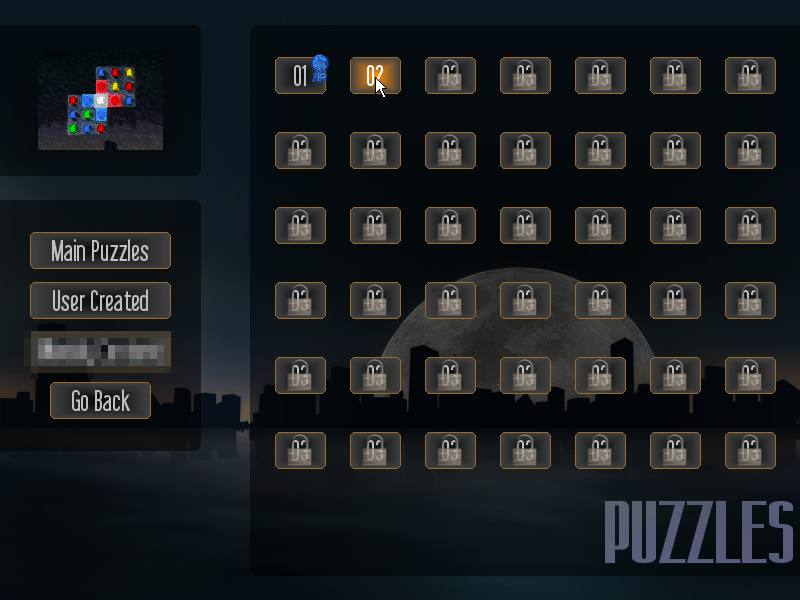
At first, you might think the menu is uglier than the other mockups, and you’d be right. But this works much better from a functional standpoint: levels that are locked and beaten are easily seen. 42 levels can be instantly displayed on the screen. Arrows do not have to be used to scroll to a certain number, taking maybe 6 seconds to get to level 34 from the other designs to just a split second in this newer design. I’m also able to mix user levels and official levels, shifting the spotlight on user created levels (they will be displayed differently than what you see in the image, and they won’t have thumbnails unfortunately).
I wanted the user levels to have thumbnails, but this cannot be done for several reasons. Not that I didn’t try…here’s a working version of the user created levels menu:
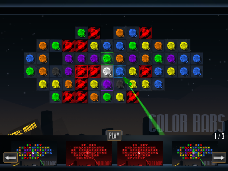
First off, Game Maker’s built in functionality allows only BMP files to be taken and exported, causing custom levels to bloat to nearly 2mb in size. The menu you see above takes four BMPs and scales them down, then blows them up at a preview size when clicked. The memory issues were very problematic, but I did get it to work. It was not quite as pretty as I wanted it, but it worked.
But the new menu works much better. It will cut down the size of user levels to under 300k or so, and there won’t be any zip files to deal with (to include both the level file and the BMP)…just download the level file. Functionality over style.
I can’t wait to finish this game, as it’s winding down to the bare essentials. So close to the finish line. Woo!
I actually really like the new Puzzle menu design, its simple and appears to be effective.
Functionality over style is actually a really big problem the Linux community suffers from. With Linux, there are two main desktop environments, GNOME and KDE. On one hand, GNOME is incredibly usable and decently pretty. On the other hand, KDE is very very beautiful but not very usable. A lot of users (I admit it, myself included) go for KDE4 at first, thinking its the clear winner, but end up switching to GNOME sooner or later because it just feels so much more efficient.
Yeah, I also think the new menu is good. And much better than the original one. Nice! 🙂
I just realised how bad the functionality would be for the design I worked on. It’d take ages to scroll through.
The new one is actually very nice, and I think it’s the one you should stick with.
I like the new one as well. It gives you a feel for how many you have finished overall.
Yes. I think your end decision was the correct one.
I, too, concur. Great choice here–after all, the game itself takes care of pretty much every aesthetic need the user could have. Anyone who likes puzzles is bound to be more focused on the puzzles themselves than the menu, and this design lends itself very well to those types of people.
hi
i think you choise the best way to do that.
if you want to make it more atractive you can use moving gems or… in background
remember lequicity
i always read blog posts but when i don’t have anything to say. i don’t write anything. why i should write?
generating revenue from a game is verry good. even if it would be less than $200
i hope that your game sell more than $3000 market it well
good day