Another Crunch Time Update, part DOS!
Everything is goin’ smooth…as smooth as it can be, anyways.
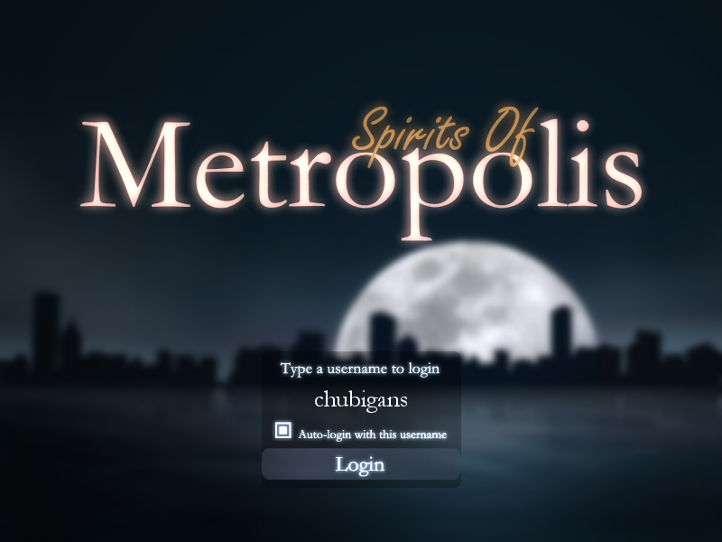
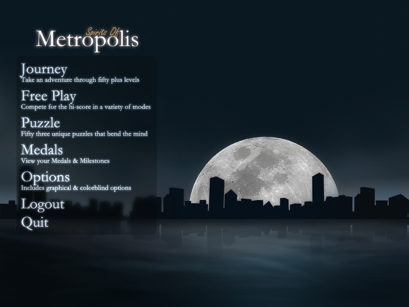
I really dislike this phase of game making…where you have to make the menus and cross your fingers that everything holds together. I’ve created the menus in a new fashion this time; instead of making them within the Spirits file, I’ve created two separate games and will merge them together once done. This allows me to compile the “menu game” much faster instead of compiling Spirits of Metropolis every time I want to see a menu in action. As a result, I’ve managed to get menus looking much swankier. The below shots are without particle effects; they’ll look much better once I merge the two games together:


So, I have the 110+ levels done, now just to get the options menu and rewards thingy tied in. This is going to be the most tedious part of the game making process…I hate every step of it. But, it has to be done, and I want to do it within one week. So, wish me luck!
Good luck, then. It’s the final stretch, so just keep thinking about the finished product.
Also, I really like the luminosity of the text in those menus; how did you achieve that effect?
There were two ways I did this. The menus are “faked” in that all the text in the second picture was lighted using Photoshop, then having option highlights appear underneath (seen in the first pic). I then set the text to a bm_add alpha channel and I’m done!
The big “Spirits of Metropolis” logo is done in real time. It starts out very bright and blurry before refocusing and ending up like you see in the pic. I did this by having two sprites…one sharp, another one super blurry. Then, I set both images as a bm_add alpha channel. Next, I placed two blurry logos within the sharp Spirits logo…one on top, and one on bottom. As I subtract the alpha from the top blurry logo to make it disappear, I add alpha to the sharp logo to make it appear. The back alpha blurry channel stays how it is. The result is what you see in the pic…it looks neater in motion.
Hope that makes sense…I’m horrible at explaining things, hah.
Oh man, this is going to be sweet. I think the login idea will be great, plus it looks pretty swanky too. 🙂
How big are both the menu and the actual game together in terms of file size? I suppose it doesn’t matter as it’s a commercial game, but I’d still be curious to know.
Those are pretty snazztastic.
In terms of MB, probably around 45 to 50 megs. Custom levels will run around 2 megs apiece, as they are a bitmap file and a special game maker file.
That’s cool. Though, I’m a little worried about the large custom levels, but I suppose that can’t be helped.
I did consider doing custom levels via code, but there are some security issues involved with that. For one thing, the levels I churn out will be “official Vertigo Games levels” so they’ll be watermarked and you’ll get a medal for beating fifty of them. That would be impossible to do via text-based code editors.
The one regret I do have is that Game Maker can only export BMP files. So the preview image hovers around a meg in itself. Thankfully it compresses rather nicely when using a zip file.
Lovely. I could buy this game just for the scenery, even if I didn’t know how good the gameplay is.
You explained fine, and the effort is worth it; it does look fantastic. Can’t friggin’ wait for this game. =D
hi congratulation.
publishing a game itself regardless of results and revenues is a success.
all games do not have the ability to publish!!! 😀
but as a friendly message i want to say take care of main exe because big EXE files load slowly on machine’s ram (vivid conseptions)
use external files and load them at runtime it’s fast even if you load of them at startup.
but for sequrity encode your files.
and if you hate menu making as much as i hate. create scripts that do much of that for you and just add or change elements for each game.
have a nice day
ashkan