My Idea Went Kablooey!
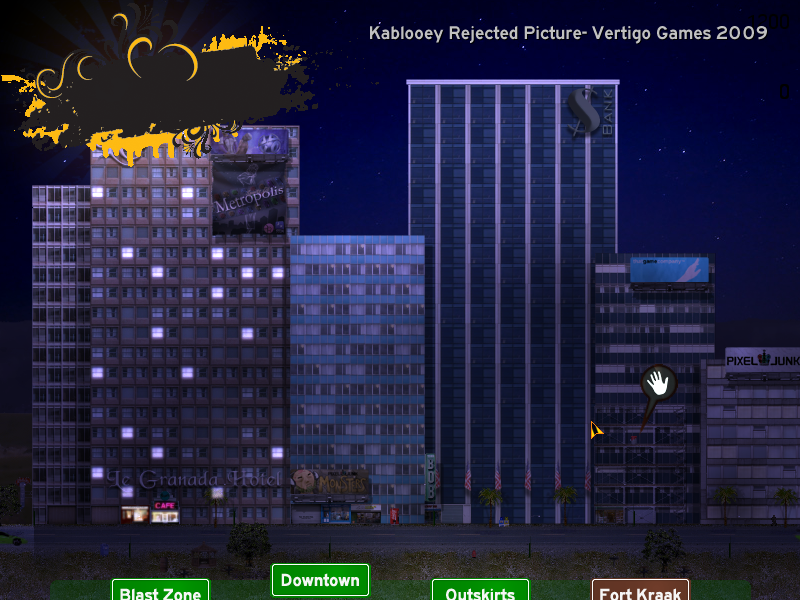
After posting about the different lighting effects in Kablooey, I said that a nighttime mode was impossible. But, after posting that blog entry I thought…well, why not give it a try?
Well, turns out I was kinda right.
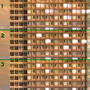
The first thing I wanted to do was create a new lighting system for the buildings. I didn’t want to retexture the buildings as all the windows were made to be shown during daytime settings, so I decided on having lights on top of the building. Taking a cue from Killzone 2, I had a pretty awesome system working: light trails that would follow the camera left to right. Here’s a good pic as an example:

The camera in Kablooey is a fixed one that pans from left to right at a fixed speed, so it’s always the same. In the window labeled 1, the camera is moving quickly and a flare of the light in the window can be seen to the right, slightly tinted purple. In window 2, the camera is slowing down into position, as is the window flare. In window 3 the camera has stopped, and the two lights have merged together. It looks great in motion.
The problem with this is that the building I’m showing is the only one that had a decent looking effect. All the other buildings looked very unnatural with the light overlay, perhaps because of the windows being directly next to each other unlike the building shown above. Not only that, but the layers, as I feared, weren’t going to work.
Let me explain the layer situation. In Game Maker, each object is assigned a number. This is the layer that it resides in. So, if the building is layer 100, and the street is layer 10 and the car is layer 1, then the building will be behind the road, and the road behind the car. The color lighting effects are at layer -1000, which means nothing should be over this layer. However, if I want the window lights to look right, I need them to not be affected by the color lighting, so the window lights are at -1500…which unfortunately puts them on top of the road and cars, and doesn’t look right.
The nighttime scene isn’t really that beneficial other than looking neat anyways, as I planned the game to be set during the day in the first place. So, no nighttime play in Kablooey…but hey, not all ideas work out during the game makin’ process. C’est la vie.

mmmm……. 🙂
Although there wont be night mode i like alot the day mode 🙂
Waiting for the game 🙂
Although I really fancied a night time, I’m not phased by the lack of one. This is indeed turning out to be a very interesting game. 🙂
The night mode looks awesome IMO. I don’t think the depth thing would cause too many problems if the lights were placed carefully. The slight overlapping isn’t really that noticeable, at least not in the picture posted.
While a night mode would be nice, I’m sure the game will be awesome nevertheless. 🙂
Honestly, I think that the night time mode looks decent with a good atmosphere. Though my opinion counts very little.
something irrelevant of the topic 🙂
will be there wallpapers for spirits of metropolis and greenTech and other games
Aww…
well, it’s not a big deal, really.
Darn… night would be awesome. Oh well I hope it all works out in the end.
Ah yes, wallpapers! I will get to work on those and have some soon.