The Many Faces of Ore no Ryomi 3 (Part 1)
There’s one obstacle that always seems to get in the way when I make games: I can’t draw. At alllllllll.
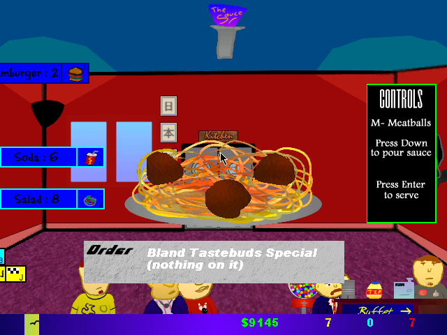
Let me remind you how Ore no Ryomi 2 looked:

…hoo boy, not too good. Thank gawd people managed to look past the horrid graphics to find the gameplay entertaining enough for us to go forward with a sequel.
So, from that point forward, I knew if I was to do a sequel, I’d need an artist. I ended up going through four different artists over the course of three years trying to get the game off the ground, with each having to drop from the project, whether it was family issues or the amount of work needed. This week we’ll focus on the first artist, Him.
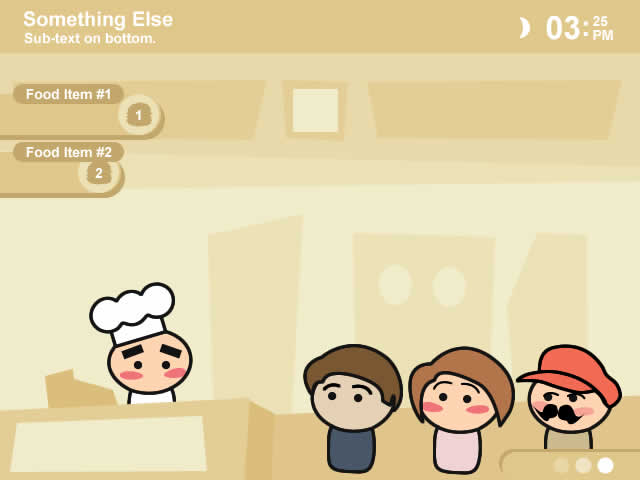
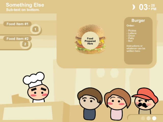
Morphosis was an excellent artist who was very involved in the GM community at the time. He was gracious enough to help with ONR2 on some of the things I just couldn’t draw. So, what better way than to team up with Morphosis (creator of the background and menus of ONR2) for another game?* The game ended up taking a simplistic design, one that was unique for it’s time and eye-catching. (click to enlarge pics:)


I think this simple design could have worked. The HUD (heads up display) would need to be shrunken down as well as the customers, but the main problem here is that it looks more like a simple flash game than a normal downloadable game. Still, I think Morphosis had something here. Unfortunately he had to drop out due to other projects he was already commissioned for, and ONR3 was stalled for the rest of that year.
Next week I’ll showcase the 3D ONR3 that was tried next, followed by another artist and finally the ONR3 pic that was to be showcased in a GM Mag last month, but pulled at the last minute. But tell me, what do you think of these now-rejected designs?
*My mistake, these drawings are from Him. Hey, it was three years ago, cut me some slack! My apologies to Him and Morphosis there.
I can understand were Morphosis was heading with this. But eh…its just way to simple, and honestly, everything just looks flat and lifeless. As you said, it looks more like a simple flash game. But for something to download? No thanks. Or for someone to buy? No way.
As a flash game, it would look great, but for a commercial game. Sorry, no thanks.
Do what YoMamasMama is doing and make everything retro. That way nobody can complain about bad graphics.
‘Course, that could deter sales.
I’ve seen these images before, but the other ones should be interesting.
Hah, minmay, the only problem with that is the fact that cooking isn’t exactly a retro genre like platforming is. 😀
Lost stole my words.
And I kinda liked ONR2’s graphics. I don’t know why, I just did.
Yeah, the ONR2 graphics were actually okay. There were just a few rough spots (tip jar, television, people, some order icons). But the larger-scale art, like the foods themselves, was pretty good.
Hang on…didn’t Him do those graphics…not Morphosis???
http://vertigogaming.net/newboards/viewtopic.php?f=3&t=481
“Here is an early look at the art direction that ONR3 is taking, thanks to Him”
Wow, I was completely wrong on that one. Thanks lost!