Kablooey! Shadows & Color Filters
With every game I make I’m actively trying to experiment with different graphical features. With The Winter Solstice, it was the first attempt at using particles for both explosions and background images. With greenTech, it was applying visual overlays to graphically distort the display. And now there’s Kablooey, which I’m attempting both color filters and shadow effects.
I’ve had a lot of graphical assets left over from the now-canceled Helicopter Cacophony 3 game, but visually it wasn’t graphically pleasing to the eyes.
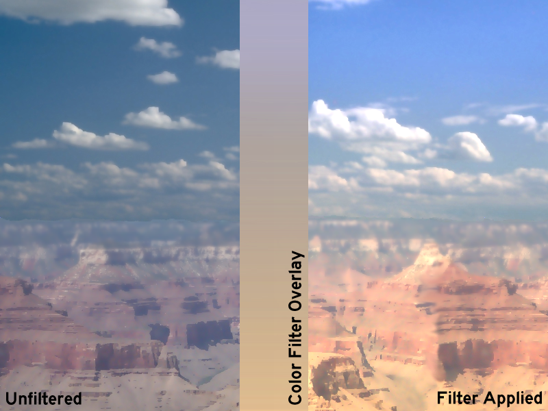
The new game I’m working on will use these assets in a different way, but what I wanted to make sure of first was to somehow enhance the visuals and tie them in all together in a coherent visual display. I did this by using a color filter over the entire game, much like greenTech used the green display screen.
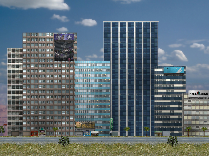
This isn’t just for the background though. Watch as the color filter is applied to the downtown section of the city:
The color tones are subtle, but it creates a pleasing look. Take a view of the blue glass building, how it’s a bit orange at the bottom but blue at the top. It suggests an illumination from the bottom grass to the blue sky. Neato.
Still, the image lacks any kind of separation…it looks more like cardboard cutouts than buildings. It was time to practice with shadows.
There are two main kinds of shadows: prebaked, and dymanic. Because dynamic shadows can topple computers easily with resource requirements, it was an easy decision to go with prebaked. Prebaked is a term used when you just need some shadows in a location, but aren’t planning to move the lightsource or interact with it (in our case, the sun). Dynamic would create shadows in real time, changing wherever the light source is (imagine a swinging bulb in a dim room). The prebaked lighting works great in Kablooey because there’s no need for real time light changes or any background elements changing on the fly.
There are two ways I’ve done shadows: literally prebaked using Photoshop and using Game Maker’s engine to provide shadows. Using Photoshop I created shadows and lights on buildings to create an illusion of maybe cloud covering overhead, or a wear and tear factor on a building. The same method was used in Sim City 4 with great results.
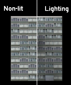
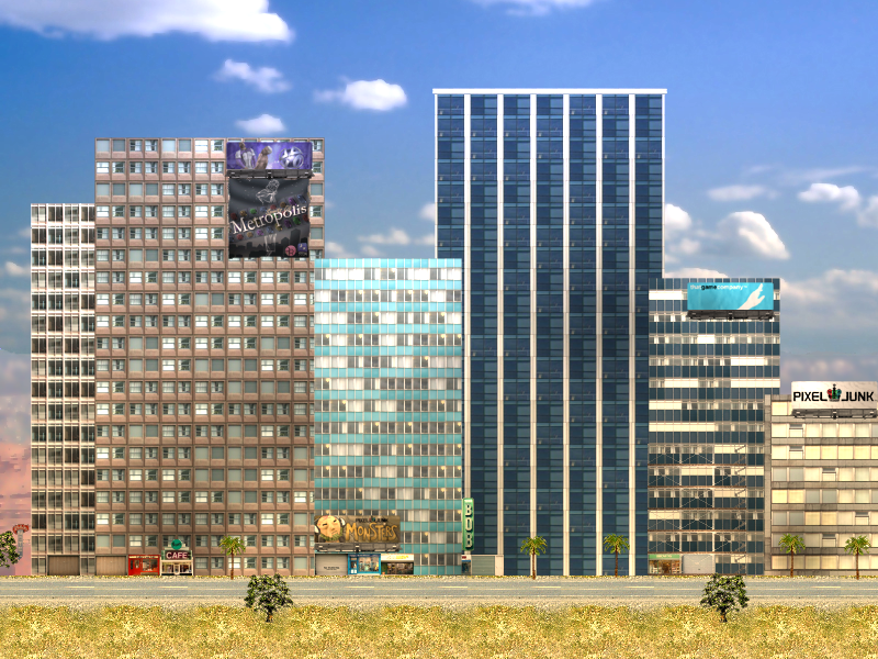
So now that that’s done, it’s time to use Game Maker to supply the rest of the shadows. Some are actual real-time blendings of sprites, but most are simply blackened versions of sprites overlaid with an alpha of 0.2 or so. Check out the way the shadows bring some depth to an image without being immediately apparent:
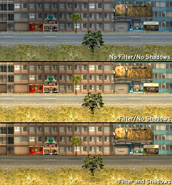
Notice how the buildings become more separated and defined, and notice the palm tree giving out three unique shadows. Theoretically the shadows don’t make sense from a global light perspective, and that’s OK, as you can get away with a lot more in 2D than you could in 3D (in 3D these shadows wouldn’t make any sense and look almost ridiculous).
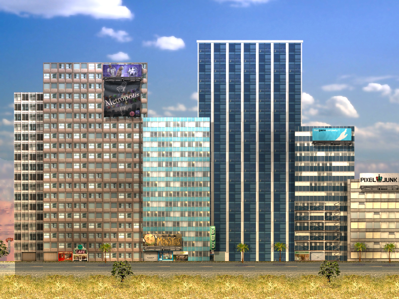
Now take a look at the final blending of shadows and lighting (note especially the scaffolding on the small blue tower with shadows, as it was barely noticeable at all in the non-shadowed version):
It’s been a blast (heh) working on Kablooey, and I look forward to unveiling the game for the first time with a teaser trailer sometime next month. Woo!
WooooooooooW 😀 Next month waiting on fire till seeing it 🙂
I see the shadow and colour filter make the graphics better and I feel more some of them infront of the other also i feel that it is paper cards with no thickness but the sprites looks amazing after the filter and shadow
Waiting Waiting Waiting 🙂
This looks awesome, I can’t wait to see the trailer.
Ooh. That’s pretty. 😀
Filters especially.
Chubigans is be awesome again.
Chubigans is be awesome always.
Oh man, that looks great. The prebaked shadows are looking really really nice and the reflections of the billboards are just awesome. 🙂
I am suprised at the amount of detail you insist on using. You have to make your game absolutely perfect, which is always a good thing. I look forward to playing it.
holy fudge this looks epic.
i don’t like the abrupt change of the road’s color at the left, though.
also i have no idea why i am typing in all lowercase.
[…] game. I was crushed, and knew I could never use the engine again. And here we are with Kablooey. You might have already read about how the game uses color filters to pull off its own unique method …, and more importantly how I said each building was pre-lit for the specific daytime filter that I […]